The Chart Tool, under the Cost Analyzer link, provides a visualization of results after a search has been executed.
Note: In order to use the Chart Tool, you must perform a search first.
To create a chart from your results, use the following steps:
1. Click the ![]() icon on the left-hand side.
icon on the left-hand side.
2. In the Chart tab screen:
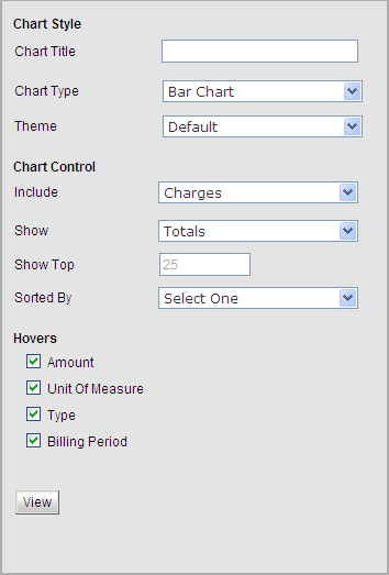
Note: Filters are grouped into sections, which may be expanded and collapsed independently. You may click a section name to expand the section and make your changes.
a. Enter or select your Chart Style parameters including Chart Title, Chart Type, and Theme.
The Theme option allows the user to change the color scheme, including the colors of bars, lines, etc. included in the chart and the background color and view.
b. Enter or select your Chart Control parameters including Include, Show, Show Top, and Sorted By.
You may choose to include Charges or Usage data results in the chart.
You may choose to show Totals or the search grain (Service Number, User, Department, Carrier). The options available to you in this drop-down list will depend on which search grain you select in the I Want to See Results By drop-down list located in the controls toolbar.
![]()
c. Select your Hovers parameters including Amount, Unit of Measure, Type, Billing and/or Period.
If you select one of the search grains (Service Number, User, Department, or Carrier) from the Show drop-down list above, a new check box will appear and you can select to include that hover. This section allows you to enable and disable information displayed when hovering over a result.
d. Click the View button.
The chart that appears shows a graphed view of the parameters you entered.
Values maybe dynamically removed from the chart by clicking the value in the chart key.
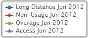
Hovering over a specific value will cause further information to be displayed.
You may switch back to tabular view by clicking the ![]() icon.
icon.
![]()